Fintech App Website
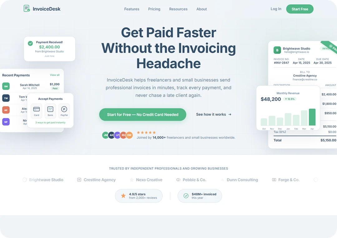
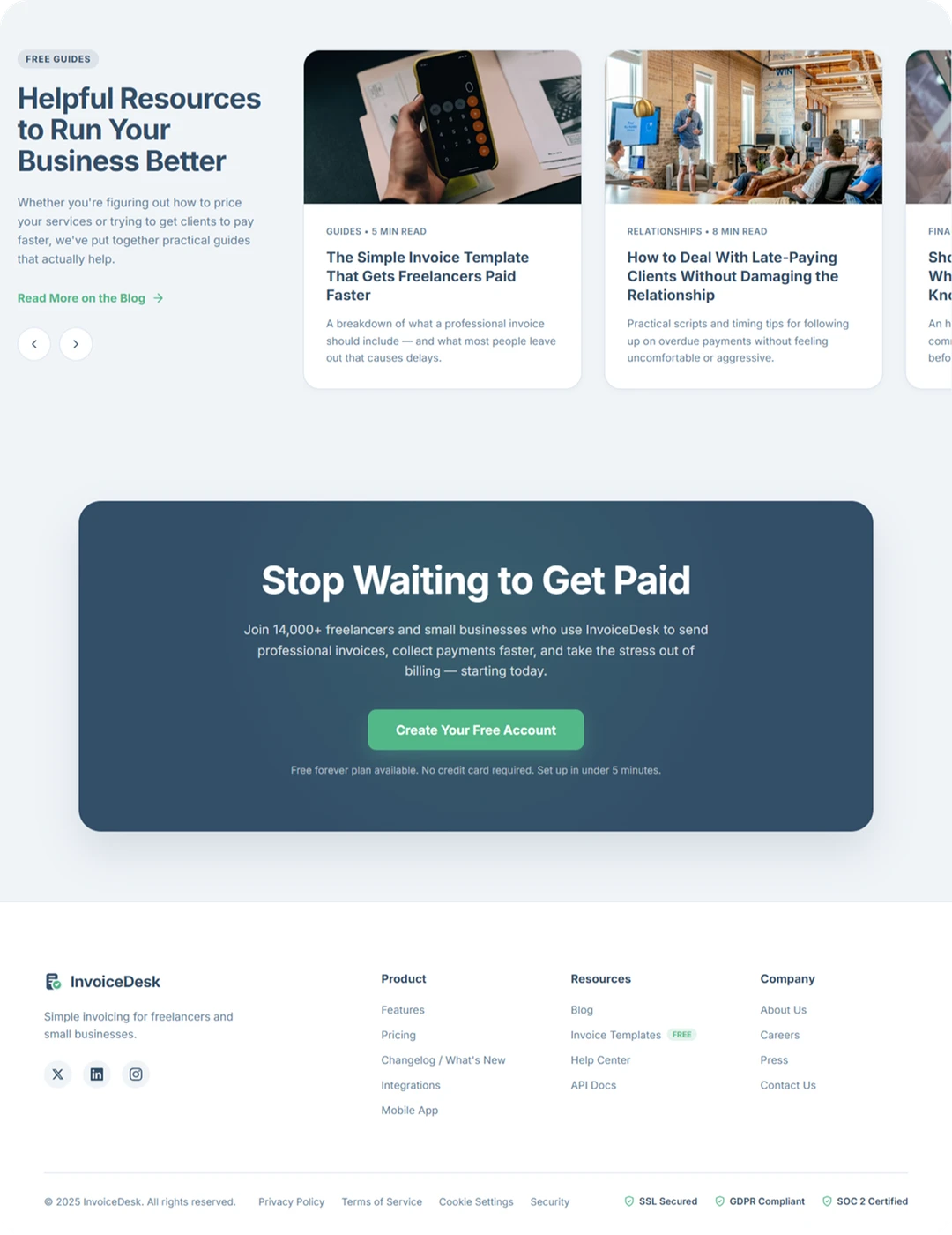
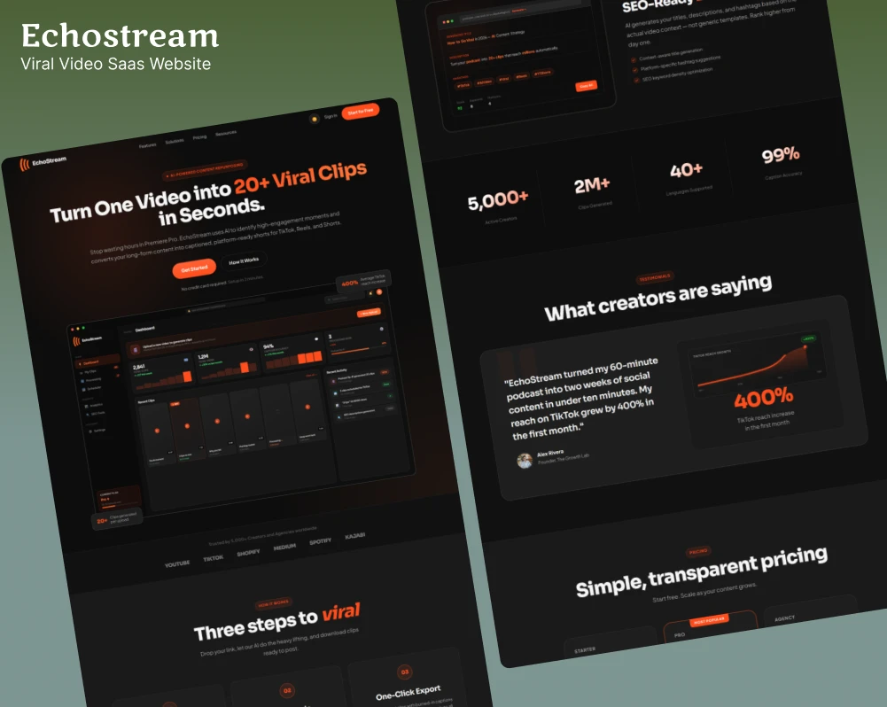
We designed a benefit oriented landing page that feels trustworthy and straightforward matching the simplicity the product itself promises.
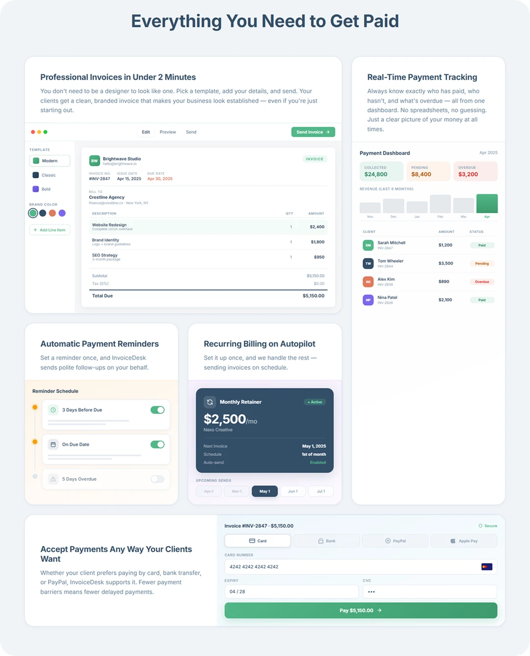
The hero leads with a pain-point headline so visitors feel understood immediately. Below that, we structured features in a two-column card layout with real UI previews so the product sells itself visually.
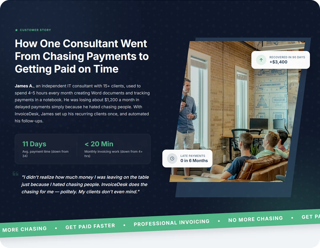
A full case study section breaks the pattern telling a real consultant's story with before/after metrics which builds credibility far better than bullet points.
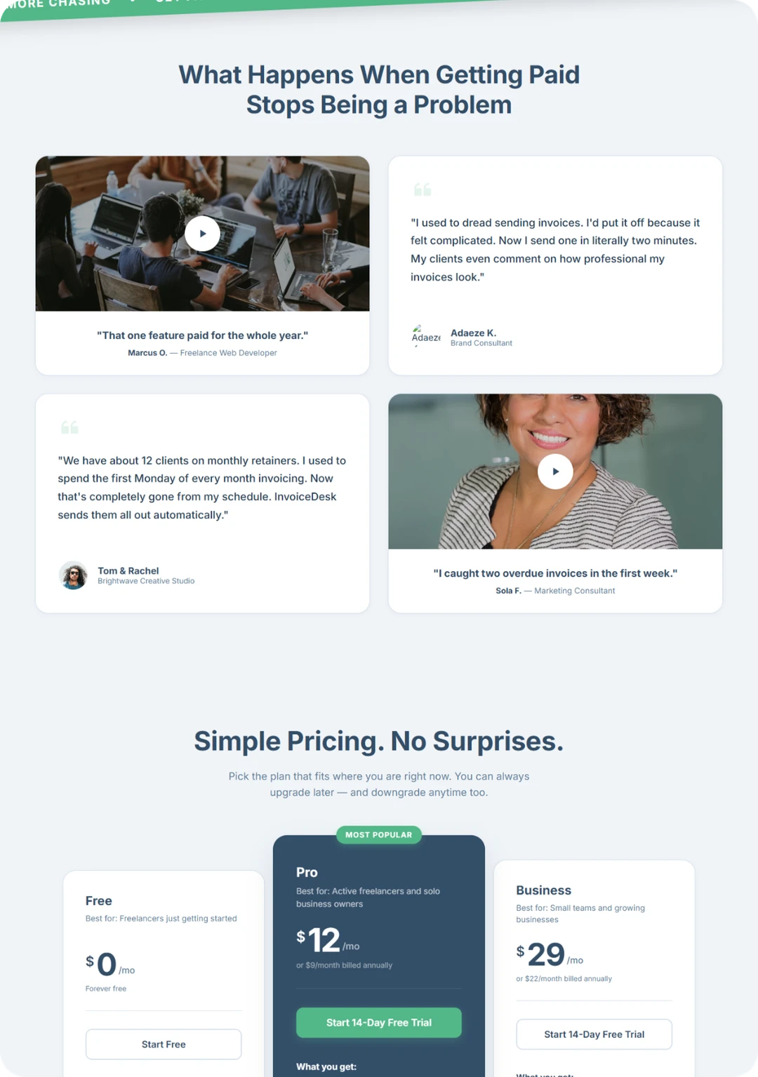
We followed that with a testimonial carousel using real photos and quotes alongside lifestyle imagery, making the social proof feel human rather than templated. Pricing is transparent and simple with a clear free tier to eliminate signup hesitation, and a blog section near the footer positions the brand as helpful before asking for anything.